Web design is instrumental in creating a strong brand image. Web design involves work on the layout and appearance of a website.
Apart from technical skills, it requires creativity and imagination to succeed as a web designer.
Still, there are mistakes in web design that can affect a website’s performance. Therefore, it is important to know what they are and how to avoid them to have a flawless web design.
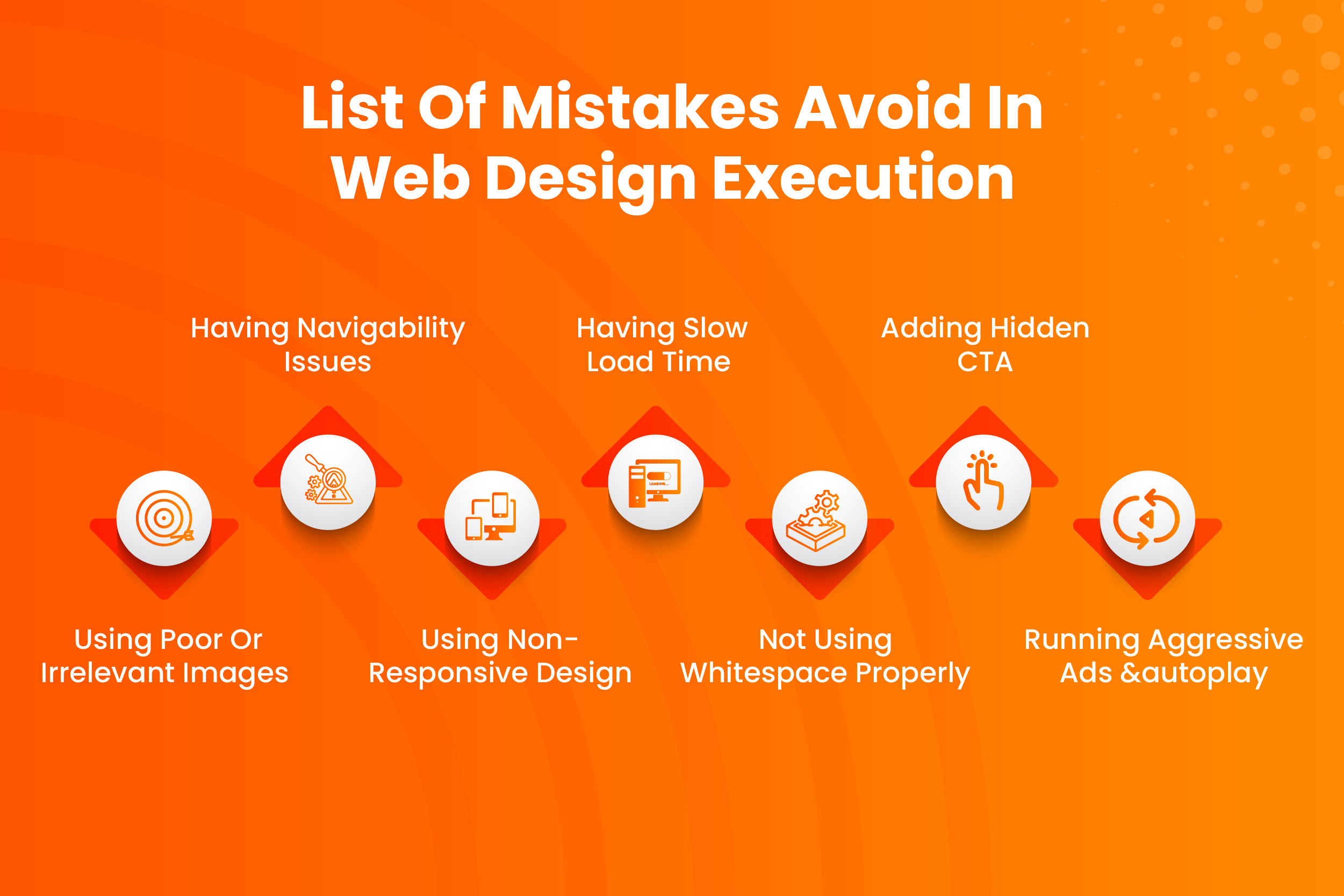
Here’s A List Of Mistakes That You Must Avoid In Web Design Execution
1) Using Poor or Irrelevant Images
Images form an important component of overall web design as they are instrumental in making the website appear attractive. Also, a lot of users first take a look at images to gauge what the website is about and then read further.
Any website that uses low-quality images or ones not relevant to the on-page content can take users away from its pages. Images should always be rich in quality and content-related.
Another thing to keep in mind while adding images is their placement. They should be placed in a manner that gives users a pleasant experience on your website.
2) Having Navigability Issues
Clear website navigation should be a top priority of web designers as it is essential for a positive user experience. Websites that do not have clear navigation can confuse users and make them leave.
Imagine going to a restaurant in Colorado where you have to enter the kitchen before reaching your table and passing the bar on your way to the washroom.
Websites must use and highlight clear titles of pages that they contain, meeting users’ expectations when they click on the same.
3) Using Non-responsive design
These days people can access your website on any device, be it laptop, mobile, or tablet. Non-responsive web design doesn’t allow the website to appear correctly on different devices.
The well-designed responsive website does not just adjust the layout as per the device user has accessed the website with; it also highlights the prominent features in the best possible way.
Responsive web design uses only a single piece of code that easily integrates with modern tools and has all the analytics in one place, thereby saving organizations time and money.
4) Having Slow Load Time
Slow Load Time is one of the most common technical mistakes in web design execution. Websites that load faster enjoy a higher engagement rate and longer session duration.
According to Google, the bounce rate of websites that take more than three seconds to load is 53 percent. Users will never stick around for the website to load when they know there are alternative fast-loading websites for similar products/services.
Website designers must include features like fast hosting, file compression, content delivery network, and optimize HTML, CSS, and JavaScript to boost website speed. Also, they must regularly delete unnecessary items from the media library and database to achieve fast load time.
5) Not Using Whitespace Properly
Whitespace refers to the space between different elements on the page like icons, text, and images. When designers leave whitespace unintentionally, it can adversely affect the layout and appearance of the website. Also, it can give the impression that the website is incomplete.
By simply increasing the whitespace between text, designers can tell users unrelated.
On the other hand, they can group the text by decreasing the whitespace. Therefore, the correct use of whitespace can improve the legibility of the text and increase readability by 20 percent.
Whitespace doesn’t always have to be white; designers can use any color to highlight certain sections of their website that go with the overall theme.
6) Adding Hidden CTA
CTA stands for call to action, which tells the user to perform a specific action. It should be visible and easy to access.
Website design execution of CTA should be done so that it allows users to complete the action with minimum effort by directly taking them to the right page.
CTA, which requires users to complete multiple steps, can turn them away from the website.
For example, if a user from Colorado comes on the website that sells clothes and selects the category of trousers, the website should display all the trousers they are selling and have a clear CTA to buy particular trousers.
Websites that ask the customer to fill out a form before they can click to buy the product or have a buy now button somewhere at the bottom of the page will turn users away.
7) Running Aggressive ads and Autoplay
After completing the initial steps involved in web design execution like gathering content and images, coding, testing, and the final launch, web designers look to make the website feature-rich. However, it may not always work.
Websites that have a lot of ads can turn users away as they can get distracted and forget the real purpose for which they accessed the website. Ads displayed on the website should always be kept to a minimum.
Autoplay can also turn users away from a particular website, especially if the user accessed it in the hope of navigating it quietly. Websites should always have a button that plays audio when clicked so that users always have control over what he wants to listen to or watch.


